

Choose three to five colors: one or two neutrals for backgrounds, one main color, one accent you use sparingly, and a dark for text. Write down their hex codes and use only those in your highlight covers, story backgrounds and graphics. That is the whole method. The rest of this guide is about picking the right few and giving each a job.
Free Black and Neutral Covers to Test a Palette
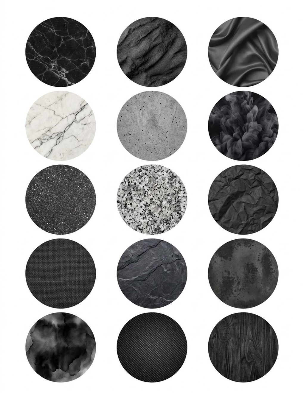
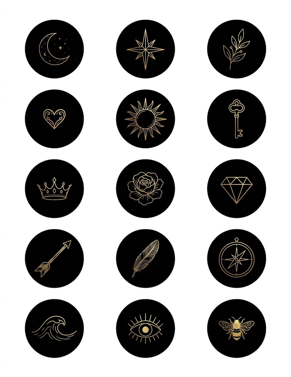
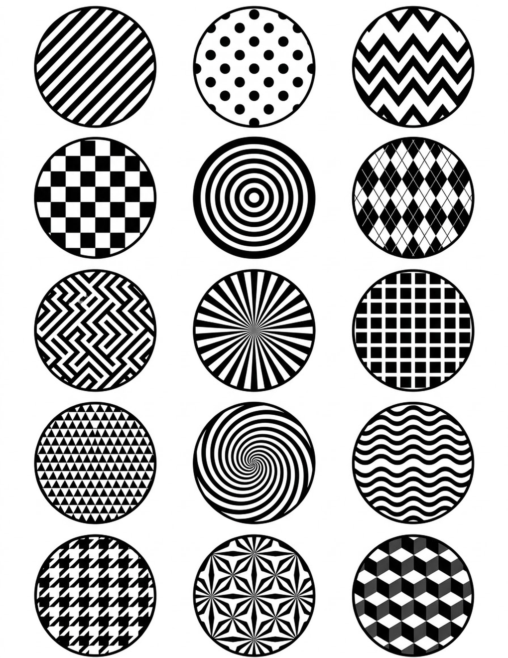
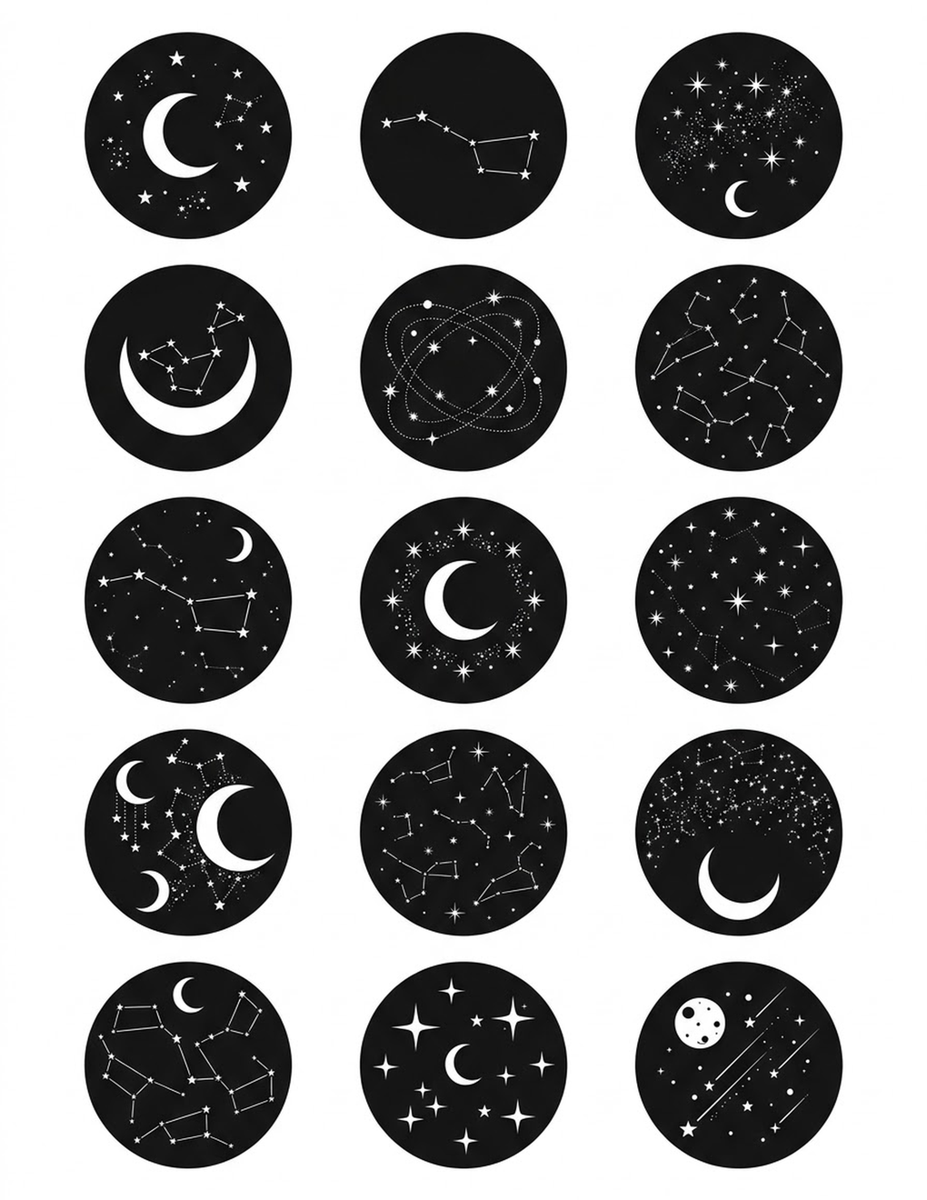
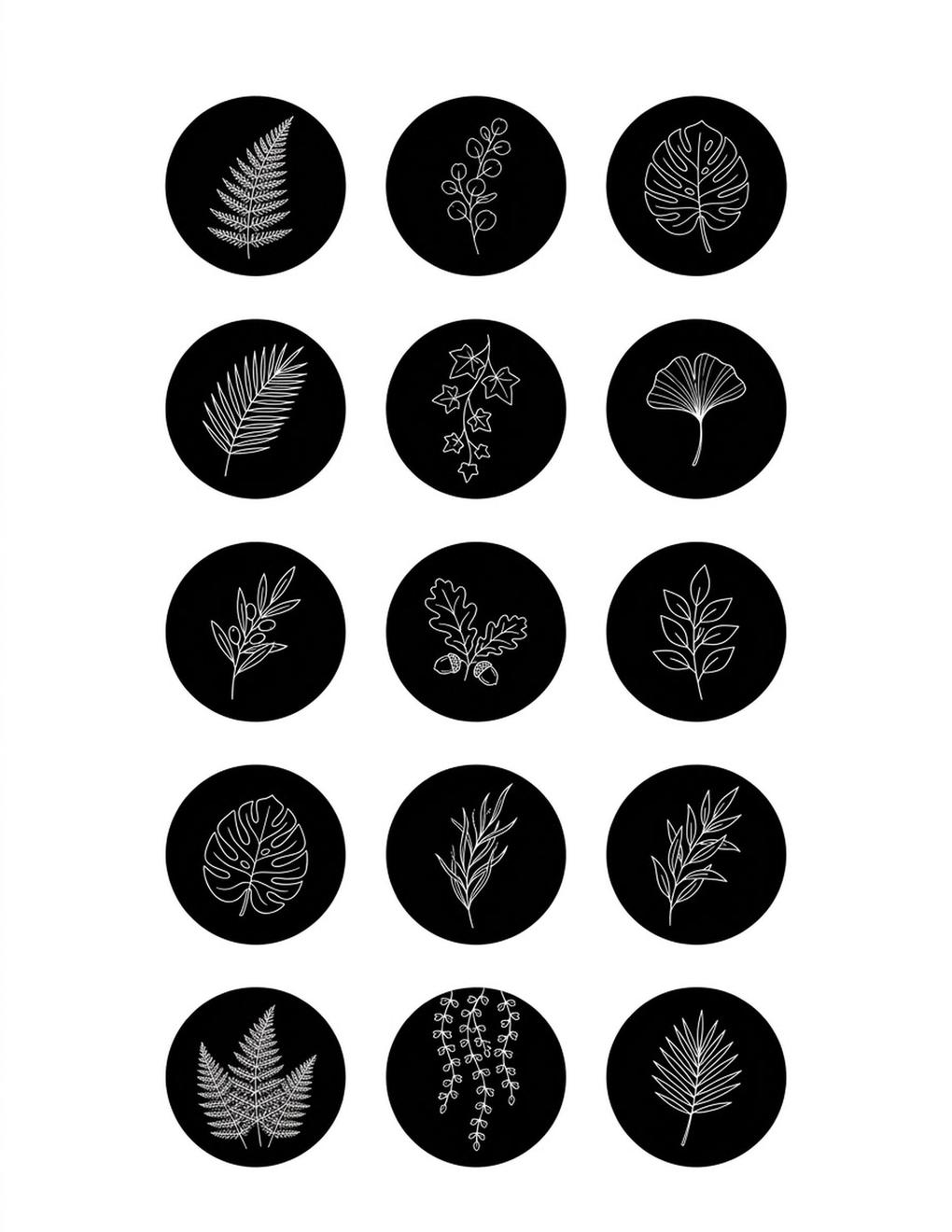
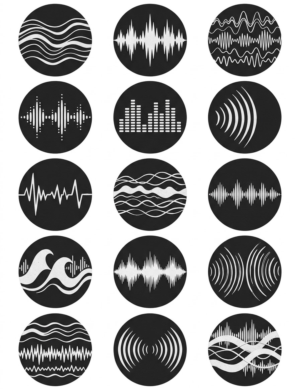
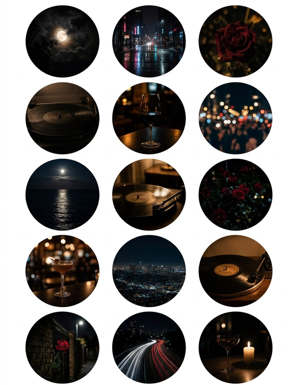
A palette is easiest to judge when you see it on a row of highlights, so here are thirteen sheets of 15 covers: dark red luxury, night city moods, black marble, dark textures, white line icons, gold on black, silver on black, black geometric, stars on black, white leaves on black and ink and smoke. Take the sheets, or the 135 separate cover images in one ZIP.
Download all 13 pages in one PDFOne PDF of 13 pages. Several sheets of black and neutral covers, 15 per sheet.






Why Three to Five
With one or two colors, everything you make looks the same and you run out of ways to show emphasis. With eight, nothing repeats often enough for a visitor to notice a pattern.
Three to five is the range in which a profile looks consistent without looking stamped out. It is also a number you can remember. If you have to look up your palette every time, you will stop using it.

Start From the Photos You Already Post
A palette has to live next to your photos, so begin there and not with a color you like in the abstract.
- Open your profile and screenshot the grid.
- Look at the screenshot from a distance, or squint. Name the two or three colors that show up most: the wood of your desk, the green of your plants, the gray of your city.
- Pull those exact colors with an eyedropper tool. Most design apps have one. In Canva it is the "Pick a color" button in the color panel, and the same panel lists "Photo colors" taken from a photo on the page.
- Note the hex code of each.
If your photos lean warm (wood, skin, sunlight, food), a warm palette of cream, sand and terracotta will sit with them. If they lean cool (sky, water, concrete, snow), start from gray, navy and white. A palette that fights your photos means editing every picture to match, and that does not last.
Neutrals Plus One Accent
The most reliable structure is quiet colors for most of the space and one strong color for the small things. Interior designers call this split the 60-30-10 rule: 60 percent a dominant color, 30 percent a secondary one, 10 percent an accent. It works on a phone screen for the same reason it works in a room: the eye needs somewhere to rest and one place to go.
| Role | Rough share | Where it goes |
|---|---|---|
| Light neutral | About 60 percent | Backgrounds of covers, story slides and text tiles |
| Main color | About 30 percent | Shapes, blocks, alternate backgrounds |
| Accent | About 10 percent | Icons, underlines, the one word you want noticed |
| Dark | As needed | Text and thin lines |
The accent earns its effect by being rare. Use it for a whole background and it stops being an accent.
A second neutral, slightly darker than the first, is the usual fifth color. It gives you two backgrounds that sit together, which is handy for alternating tiles; several feed layouts depend on exactly that.
Three Example Palettes
These are illustrations of the structure, with real hex codes you can paste in and adjust.
| Palette | Light neutral | Main | Accent | Dark |
|---|---|---|---|---|
| Warm neutral | #F5EFE6 cream | #D9C5B2 sand | #C9796B terracotta | #2B2B2B charcoal |
| Soft pink | #FAF7F2 off-white | #E8B4B8 blush | #C9A227 gold | #3A3A3A dark gray |
| Cool blue | #F2F5F7 pale gray | #1F3A5F navy | #E8C547 mustard | #1A1A1A near black |
Notice that none of the darks is pure black and none of the lights is pure white. Slightly softened versions look less harsh on a screen and sit more comfortably next to photos.
How well do these pairs read? Contrast can be measured as a ratio from 1:1 (identical) to 21:1 (black on white), and the figures below are calculated from the hex codes with the standard formula used in web accessibility guidelines.
| Palette | Dark on light neutral | Accent on light neutral | Accent on main |
|---|---|---|---|
| Warm neutral | 12.4:1 | 2.9:1 | 2.0:1 |
| Soft pink | 10.6:1 | 2.3:1 | 1.3:1 |
| Cool blue | 15.9:1 | 1.5:1 | 6.8:1 |
The lesson is in the middle column. Every accent here is weak against its own light neutral, so an accent-colored hairline icon on a pale cover will fade. Use the dark for thin icons and text, and keep the accent for solid shapes, or put it on a background where it stands out, as mustard does on navy.

Where Each Color Goes
A palette only shows if the same colors turn up in the same places. Decide once.
Highlight covers. Background in the light neutral or the main color, icon in the dark, or in the accent where the contrast holds. On most profiles the covers form a row right under the bio, so this is where a palette is seen first.
Story slides. Text slides, polls and announcements on the light neutral, with the accent for one word or a sticker. Stories saved to highlights then match their own cover.
Graphics on the grid. Text tiles and announcements in the palette. Photos do not need a color filter; they need to not clash.
Profile picture. A background in the main color or a neutral ties the avatar to the row next to it. The details are in profile picture ideas.
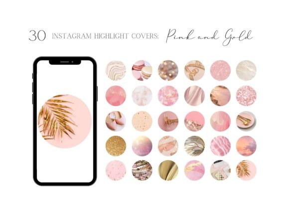
Ready-made cover sets are a quick way to see a palette in action, because each one already commits to a narrow color family. These three stay within pink and add gold, marble or abstract shapes as the second note.
Pink and Gold Instagram Highlight Covers
See the listing ↗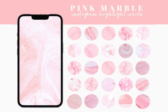
Pink Marble Instagram Highlight Covers
See the listing ↗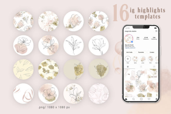
Pink Abstract Instagram Highlights
See the listing ↗From the collection Pink Highlight Covers. New Creative Fabrica members get 10 free downloads, and any of these can be one of them.
The same structure in a darker, more formal register: black or beige with one metallic or muted accent.
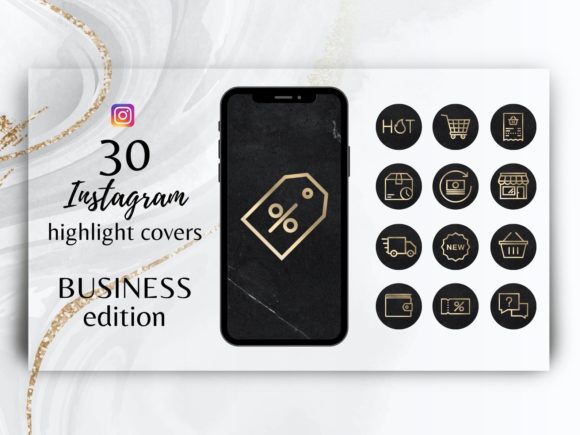
Black and Gold IG Highlight Covers
See the listing ↗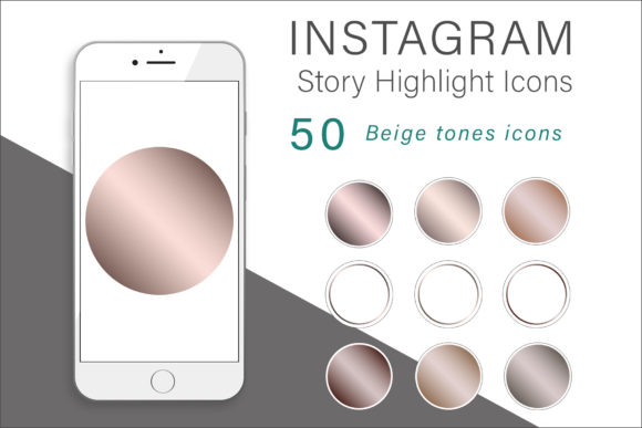
Beige Tones Instagram Highlights Icons
See the listing ↗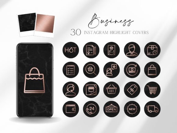
Black and Rose Gold Highlight Covers
See the listing ↗From the collection Black & Neutral Highlight Covers. New Creative Fabrica members get 10 free downloads, and any of these can be one of them.
You can also work the other way round. If you find a set you love, pull its colors with the eyedropper and make them your palette.
Save the Hex Codes
A hex code is the six-character label for an exact color, such as #C9796B: two characters each for red, green and blue. "Dusty pink" means a different shade every time you pick it by eye; a hex code is the same everywhere.
Keep the codes where you will actually find them:
- A pinned note on your phone titled "Palette", with each code and its role.
- A small image with five swatches and their codes, saved to the same album as your covers.
- The saved-colors feature of your design app, if it has one on your plan. Canva's is the Brand Kit: on the free plan it holds one palette of up to three colors, and paid plans allow up to 100 palettes of 100 colors each, per Canva's Help Center. Three slots cover the main color, the accent and the dark; keep the neutrals in your note.
When you customize a template, paste the code in; do not match by eye. The steps for recoloring a whole cover set at once are in the guide to customizing highlight covers in Canva.
Test Before You Commit
Colors behave differently small, in groups and on different backgrounds. Test all three.
A mock grid. Lay out nine rectangles in three columns. Fill some with your recent photos and some with palette-colored tiles. If a tile jumps out more than the photos, that color is too strong for a background and belongs in the accent slot.
A mock highlights row. Make five circles with the cover background color and a simple shape in the icon color. Shrink the row until each circle is the size of a shirt button. The icons should still be visible. If they fade, increase the contrast between the icon color and the background.
Light and dark mode. Instagram has a dark mode, so the profile background is white for some viewers and black for others. Place your row on both. A very pale cover can lose its edge on white, and a very dark one can sink into black; a mid-tone background or a contrasting icon keeps it readable either way.
Text contrast. Put a line of small text in your dark on your light neutral, and in your light on your main color. If you have to lean in to read either one, the pair is too close. For a number to aim at, the web accessibility standard WCAG asks for a contrast ratio of at least 4.5:1 for normal text and 3:1 for large text; free online contrast checkers give the ratio for any two hex codes.
A color that looks perfect as a large swatch often looks weaker as a thin line. Always test the accent at the size you will use it: an icon stroke, not a full square.
Common Palette Mistakes
- Two accents. They compete. Demote one to "main" and use it in bigger, calmer areas.
- All mid-tones. With no light and no dark, there is nothing to put text on. Add a near-white or a near-black.
- Chasing a trend color that matches nothing you photograph. Start from your pictures.
- Picking colors on a laptop only. Check them on your phone, where every visitor will see them.
Live With It for a Month
Set the covers, restyle your next few story slides, and post as usual for four weeks. Do not add colors during that time.
At the end, look at the profile as a whole. If one color never got used, drop it. If you kept reaching for a shade that is not in the palette, swap it in and retire the one it replaced. For covers in single color families to try along the way, see the pink highlight covers collection.
Cover Sets Related to This Guide
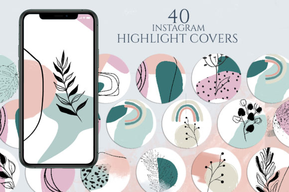 Pink Highlight Covers11 hand-picked · open the collection →
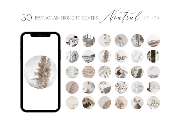 Black & Neutral Highlight Covers11 hand-picked · open the collection →
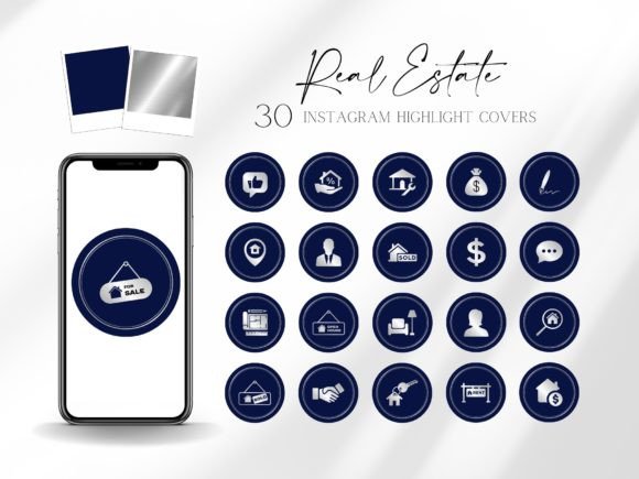 Colorful Highlight Covers11 hand-picked · open the collection →


