

A profile picture works when it can be recognized at the size of a pea. That means one subject, cropped tight, with strong contrast against a plain background and nothing important near the corners. A face should fill most of the circle. A logo should be reduced to a simple mark or initials. The ideas below all follow from those few rules.
Free Pink Covers to Match Your Profile Picture
A profile picture and a row of highlights should look like one family, so here are twelve pink sheets of 15 covers: cherries and bows, pink flowers, bows and satin, blush icons, pink watercolor, pink hearts, pink sweets, pink bubbles, pastel clouds, ballet pink and rose gold. Download the sheets or the 150 separate cover images in one ZIP.
Download all 12 pages in one PDFOne PDF of 12 pages. Several sheets of pink covers, 15 per sheet.



Where the Picture Appears
The version on your profile page is the largest anyone sees, and it is not large. Everywhere else it is much smaller: beside each post in the feed, next to every comment you leave, in the stories row at the top of the feed, in search results and in the message inbox.
Most people meet your picture in those small places first. They see it next to a comment or in the stories row, long before they visit your profile. So judge every candidate at its smallest size, not on the edit screen.

Plan for the Circle
You upload a rectangular image and Instagram displays a circle cut from it. Start with a square, since that makes the circle easy to predict: it touches the middle of each side and removes the four corners.
- Keep the subject inside the circle, with a little air around it. A head that touches the rim looks cramped.
- Leave room for the story ring. When you have an active story, a colorful ring appears around the picture. Detail at the very edge competes with it.
- Upload a large enough file. Instagram's Help Center gives no size for profile pictures. Size guides agree that the picture is kept as a 320 x 320 pixel square, that 110 x 110 is the minimum, and that it is shown at only about 110 to 150 pixels across. Anything square from 320 pixels up works; a larger square, up to about 1080 x 1080, simply gives Instagram more to scale down from. A tiny upload looks soft.
- Fill the corners with background, not content. The circle hides about 21 percent of a square, all of it in the corners.
Highlight covers shown as circles are cropped the same way, so the logic in the highlight cover size and safe zone guide applies here too.
Face or Logo
| Account | Better choice | Why |
|---|---|---|
| Personal | Your face | Friends look for you, not a symbol |
| Creator, coach, freelancer | Your face | People follow a person and recognize you in comments |
| Shop with a known name | Logo mark | The product is the identity, and staff may change |
| One-person shop | Either | A face builds trust; a mark looks established. Choose one and keep it |
| Pet or hobby account | The subject | The dog, the plant, the finished piece |
If you are unsure, ask what a follower would recognize faster at small size. For most individuals, that is a face.
Ideas for a Face Photo
- Head and shoulders, cropped tight. Your face should take up most of the circle. A full-length photo turns you into a stick figure.
- A plain wall in a palette color. A painted wall, a sheet of colored paper or a door works. A single flat color behind you does more for recognition than any filter.
- Window light from the front or side. Stand facing a window. Avoid overhead lights, which put shadows under the eyes, and avoid a bright window behind you, which turns you into a silhouette.
- Eyes to the camera. At thumbnail size, a direct look reads as a person. A profile view reads as a shape.
- One prop that says what you do. A paintbrush, a mug you made, headphones. Hold it near your face so it stays inside the circle.
- A consistent accessory. Glasses, a hat or a bright lipstick become part of how people recognize you in a row of tiny circles.
- An illustrated portrait. A simple drawn version of your face in your palette. Fewer details than a photo, which can help at small sizes.
Skip group shots, sunglasses that hide your eyes, and busy backgrounds such as beaches or city streets. Each one adds detail that the small size cannot carry.

Ideas for a Logo or Mark
A full logo with a name and a tagline is designed for a sign or a website header. Shrunk into a small circle, the letters become a gray line. Use a simplified version.
- Initials or a monogram. One or two bold letters on a solid background.
- The symbol alone. If your logo has an icon, use only that.
- A short name set large. A name of four or five letters can work if the letters nearly fill the circle. Longer names cannot.
- A product on a plain background. One candle, one mug, one bouquet, photographed straight on.
- A single line drawing. The same style as your highlight icons, so the avatar and the row look related.
Whatever you choose, make the lines thicker than feels necessary. Thin, elegant strokes disappear first.
Contrast and Background
Contrast is the difference between the subject and what is behind it. It decides whether the picture reads at all.
Put a dark subject on a light background, or a light subject on a dark one. Dark hair against a dark wall merges into one blob. A white logo on pale beige fades out.
Then think about what surrounds the circle. The profile page is white for people using light mode and black for people using dark mode. A picture with a pure white background has no visible edge on white. A soft color, a mid-tone or a thin outline keeps the circle defined in both.
Take a screenshot of the stories row on your phone and paste your candidate picture over one of the circles. If you can pick it out with a glance, the contrast is right.
Match It to Your Covers and Palette
On most profiles the picture sits just above the highlights row. Together they are among the first things a visitor sees, so they should look like they belong to the same account.
Three simple ways to tie them together:
- Shared background color. Use the same color behind your face or logo as behind the cover icons.
- Shared accent. If the covers use terracotta icons, wear or hold something terracotta in the photo.
- Shared drawing style. Line-art covers next to a line-art avatar.
If you have not chosen colors yet, do that first; choosing an Instagram color palette explains how to get from your photos to a short list of hex codes.
This site has no profile picture templates, so the closest useful thing is the covers that sit next to the picture. These three are named for line art, white and pastel styles: plain backgrounds that are easy to echo in a photo.

One Line Art Highlight Covers
See the listing ↗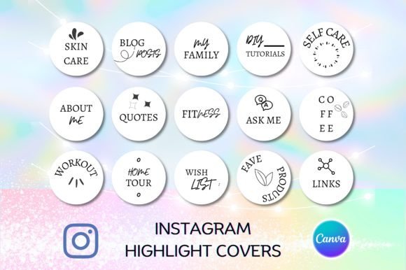
White Instagram Highlight Covers
See the listing ↗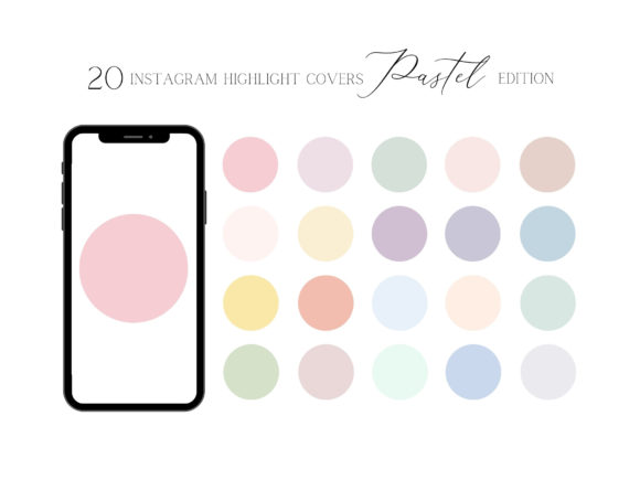
20 Pastel Highlight Covers for Instagram
See the listing ↗From the collection Instagram Highlight Covers. New Creative Fabrica members get 10 free downloads, and any of these can be one of them.
More styles to match against are in the full Instagram highlight covers collection.
Keep It the Same
Recognition comes from repetition. People learn your small circle the way they learn an app icon, and every change resets that.
- Change the picture rarely: when your look, your logo or your palette truly changes.
- Use the same picture on your other platforms, so someone who knows you from one finds you on another.
- When you do update, keep one element constant, such as the background color or the crop, so the new picture still feels familiar.
Seasonal swaps and frequent refreshes are tempting, but they make you harder to spot in a comment thread.
One caution before you choose: the Help Center points out that an Instagram profile picture is public to everyone, on or off Instagram, including people who have no account. Pick a photo you are comfortable with strangers seeing.
A Simple Setup for the Photo
Window light and a plain wall are enough for most profile pictures. If your room has neither, a small setup gives you the same two things: even light from the front and one flat color behind you.
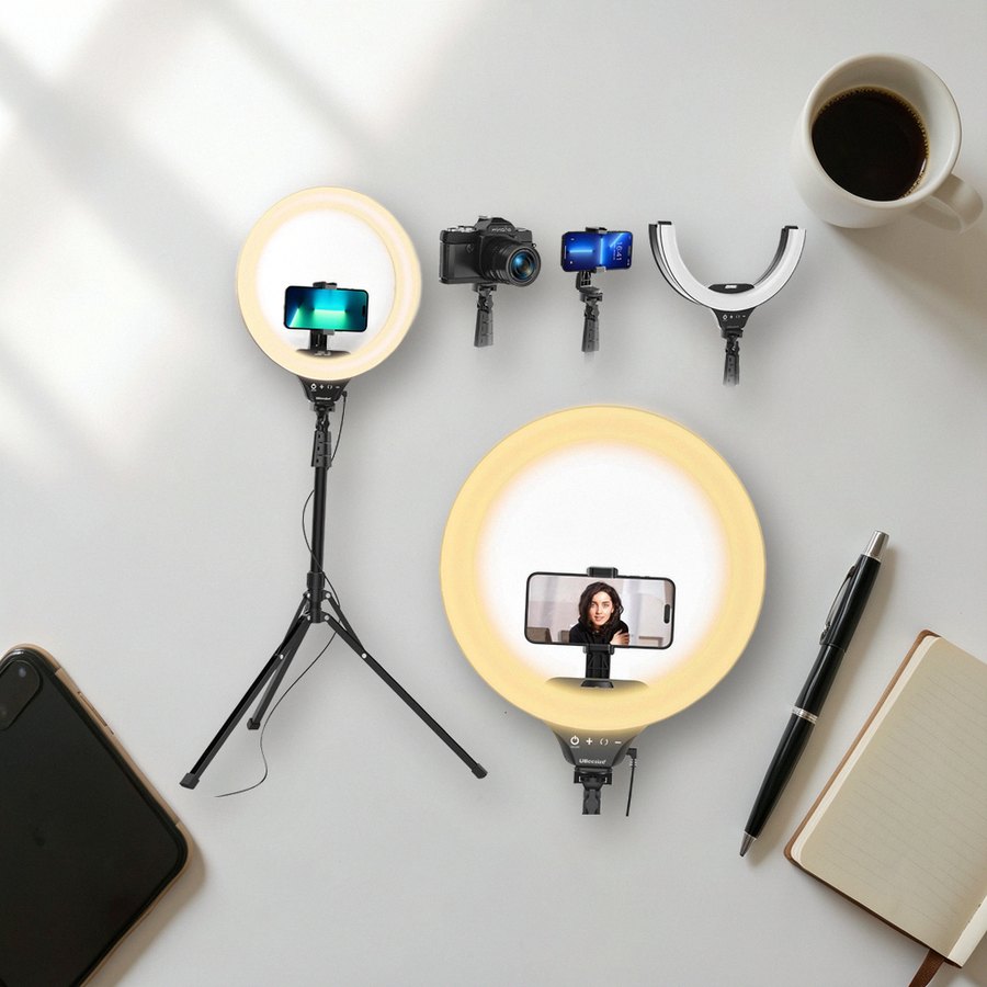 Ring light with tripod standUBeesizeSee it on Amazon
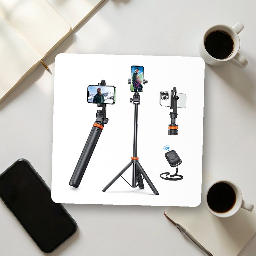 Phone tripod with remote shuttereucosSee it on Amazon
 Poster board in assorted colorsSchool SmartSee it on Amazon
As an Amazon Associate we earn from qualifying purchases.
A remote lets you take the shot yourself and keep your eyes on the lens.
Run the Squint Test
Before you upload, check the picture the way a stranger will see it.
- Crop it to a square with the subject centered.
- Shrink it on screen until it is about the size of a shirt button, or hold the phone at arm's length.
- Squint. You should still see one clear shape and be able to say what it is.
- Place it on a white background and on a black one. The edge should hold on both.
- Compare two or three candidates side by side at that size and pick the one you can identify fastest.
Then upload it: on your profile tap "Edit profile", then "Edit picture or avatar", and choose the photo from your library. Look at your own comment under a post, where the picture is at its smallest. If it reads there, it reads everywhere. Once the picture is settled, the bio beside it is the next thing to tidy; the four-line bio formula takes about ten minutes.
Cover Sets Related to This Guide
 Instagram Highlight Covers13 hand-picked · open the collection →
 Aesthetic Highlight Covers13 hand-picked · open the collection →


