

A feed layout is a rule about what goes where on your profile grid: "every post uses the same three colors", or "every other post is a quote". The seven layouts below run from almost no upkeep to a lot. If you post irregularly, choose a consistent color palette and stop there. If you plan posts in advance and never skip, the patterned layouts are open to you.
Free Colorful Covers to Match Your Feed
To see how bright covers sit above a feed, here are eleven sheets of 15 covers: color gradients, abstract shapes, bold flowers, sunset skies, rainbow swirls, bright fruit, cartoon stickers, bold geometry and retro rainbows. Download the sheets or the 135 separate cover images in one ZIP.
Download all 11 pages in one PDFOne PDF of 11 pages. Several sheets of colorful covers, 15 per sheet.


How the Grid Works
Three facts about the profile grid decide which layouts are possible.
It has three columns. Each new post takes the top-left position and pushes every older post one place along. A post that was in the left column moves to the middle, then to the right, then down a row. Any layout based on position has to survive that shuffle.
It shows a cropped preview. The thumbnail on the grid is not the whole post. It is a center crop, and its shape is decided by Instagram, which has changed it before: grid thumbnails were square for years and, since January 2025, are a taller 3:4 rectangle. Layouts that depend on exact edges are fragile for this reason.
It can now be rearranged. In June 2026 Instagram released a "Reorder grid" option: tap and hold any post on your profile, choose "Reorder grid", and drag posts into a new order. Pinned posts stay fixed at the top. This does not make the strict layouts easy, but it means one stray post can be dragged back into line.

What the 3:4 Crop Cuts Off
The grid shows the middle of each post in a 3:4 frame. How much disappears depends on the shape you posted.
| Post shape | Size in pixels | What the grid shows | What is cut |
|---|---|---|---|
| 3:4 portrait | 1080 x 1440 | The whole image | Nothing |
| 4:5 portrait | 1080 x 1350 | About the middle 1012 px of the width | About 34 px on each side |
| 1:1 square | 1080 x 1080 | The middle 810 px of the width | 135 px on each side |
| 9:16 reel cover | 1080 x 1920 | The middle 1440 px of the height | 240 px at the top and bottom |
The sizes in the second column are the standard upload sizes; the last two columns are plain arithmetic on a 3:4 frame. Instagram's Help Center says photos are kept at their original shape when the aspect ratio is between 1.91:1 and 3:4, at a width of up to 1080 pixels, so a 3:4 image is the tallest photo it will show uncropped in the feed and the only shape the grid shows whole.
1. One Consistent Color Palette
Every post shares the same few colors or the same photo edit. There is no pattern to maintain, so the order of posts does not matter.
This is the layout to start with. It survives missed weeks, pinned posts and last-minute photos, and it still makes the grid look deliberate. It needs one decision up front, which the guide to choosing an Instagram color palette covers.
2. Checkerboard
Two kinds of post alternate: photo, then graphic, then photo. Because the grid has an odd number of columns, strict alternation produces a checkerboard on its own.
The most common version is quote alternation: a photo, then a text tile on a plain background in a palette color. A second version alternates light and dark images.
The rule is simple, but it is strict. Post two photos in a row and the board turns into stripes until you post two graphics in a row to correct it.

3. Row by Row
Each row of three shares a theme, a color or a background. One row is a product in three angles, the next is three tips on the same colored tile.
It reads clearly, but the rows only line up when your total number of posts is a multiple of three. Post one extra image and every row is split across two lines. People who use this layout publish in threes, or tidy up afterward with "Reorder grid".
4. Vertical Column
One column, usually the middle, holds a single type of post: all quotes, all one color, all portraits. The columns on either side are free.
To hold the column, every third post must be the column type. Like the row layout, it drifts sideways the moment you post out of sequence.
5. Borders
Every image sits inside a frame, most often white, so the grid looks like a wall of prints with space between them. Shapes can vary: a tall photo in one frame, a wide photo in the next.
There is no posting order to keep, which makes borders nearly as forgiving as a palette. The cost is size: the picture inside the frame is smaller, both on the grid and in the feed. Use the same frame color and the same margin every time, or it looks like a mistake.
6. Puzzle
One large design is sliced into tiles that connect across the grid, so shapes and lettering run from one post into the next.
It looks impressive on the profile and has three real weaknesses. A single tile seen alone in the feed is a fragment. One unplanned post shifts every tile and breaks the picture. And because the pieces meet at the thumbnail edges, a change in the grid crop misaligns the whole thing, which is what happened to square puzzle feeds when the grid went to 3:4. Slice any new puzzle into 3:4 tiles, and treat it as a short campaign of six or nine posts, not a permanent style.
7. Color Blocks
The grid moves through colors in stages: several posts in warm beige, then several in sage, then several in blue. Each block can be a season, a product line or a theme.
Order matters only loosely, since a block does not need an exact count. It suits accounts with clear phases, and it needs enough content in each color to make a block visible, at least six posts.
Upkeep at a Glance
| Layout | Posting order matters | What breaks it | Upkeep |
|---|---|---|---|
| Consistent palette | No | An off-palette photo | Low |
| Borders | No | A different frame or margin | Low |
| Color blocks | Loosely | Too few posts per color | Medium |
| Checkerboard | Yes, alternate | Two of the same type in a row | Medium |
| Vertical column | Yes, every third | One out-of-sequence post | High |
| Row by row | Yes, in threes | A post count not divisible by three | High |
| Puzzle | Yes, exactly | Any unplanned post, any crop change | Very high |
One thing shifts every position-based layout: pinning. Instagram lets you pin up to three posts ("Pin to main grid" in a post's options menu). A pinned post moves to the top of the grid, and everything below it slides along by one. If you use a checkerboard, a column or rows, either do not pin, or pin a full row of three. Unpinning sends a post back to its original spot.
"Reorder grid" lowers the stakes for every row in this table, since a mistake no longer means deleting or archiving posts. It is still manual work, and it is new enough that it is worth checking how your arrangement holds after the next post goes up.
Keep Key Content Centered
Whatever layout you choose, design each post knowing the grid will show only its middle.
- Put faces, products and headline text in the central area of the image, away from every edge.
- Let backgrounds, textures and plain color run out to the edges, where losing a strip does no harm.
- On text tiles, leave a generous margin all round. Words that touch the edge of the full post will be cut on the grid.
- For video, choose a cover frame with the subject in the middle.
- When a thumbnail still lands badly, fix it after posting. Open the post, tap the three-dot menu and choose "Adjust preview", then drag the image inside the 3:4 frame. Only the grid thumbnail changes; the post itself stays as it was.
Before you publish, picture a slightly smaller rectangle in the center of your image. On a square post that is the middle three quarters of the width. If everything important is inside it, the grid preview will be fine.
Preview Before You Post
A layout is easier to keep when you can see the next few posts in place.
The simplest method needs no extra app. Make an album on your phone and add the images you intend to post, newest first. Viewed as a grid of thumbnails, the album gives a rough picture of how they will sit together.
For a closer look, build a mock grid in a design tool: three columns of 3:4 rectangles (1080 x 1440 pixels each, or any size in that ratio), with screenshots of your current top row underneath. Drop the next nine images in and look for the one that does not belong. Fix it there, where it costs nothing.
The Row Above the Grid
On most profiles the highlights row sits directly above the first line of posts, so it is part of the layout whether you plan it or not. Six covers in six unrelated styles above a careful grid undo the effect.
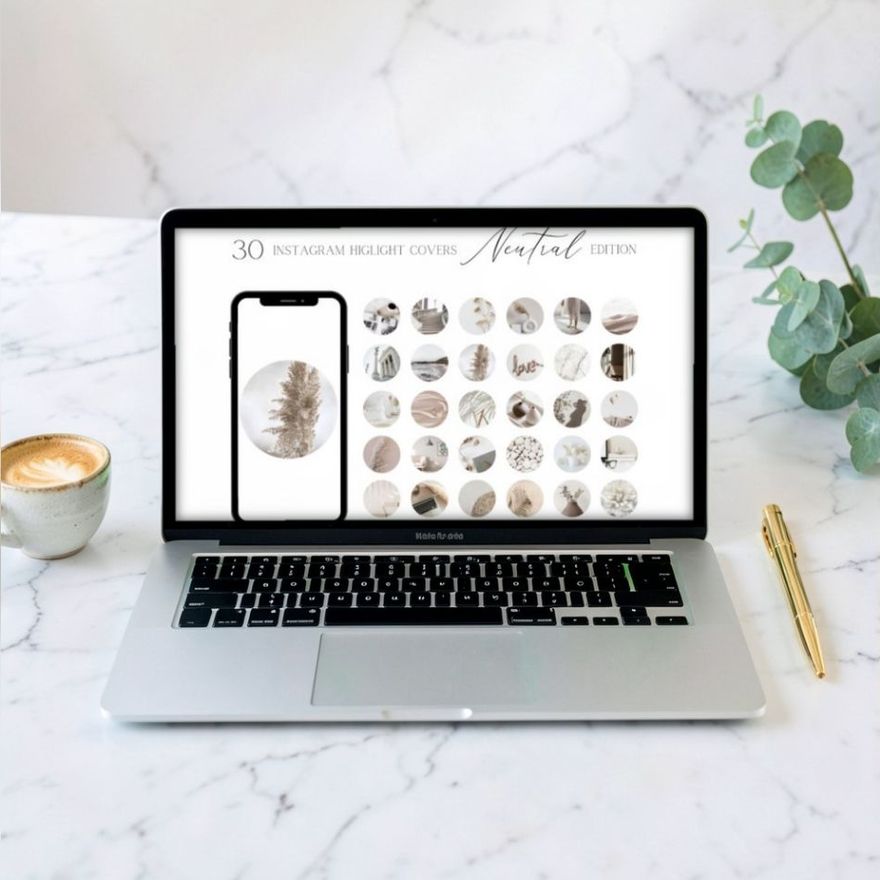
Match the covers to the calmest color in your feed. For a neutral or beige grid, sets like these three keep the row quiet and let the photos lead.
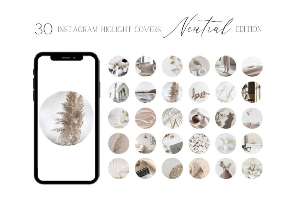
Neutral Highlight Covers for Instagram S
See the listing ↗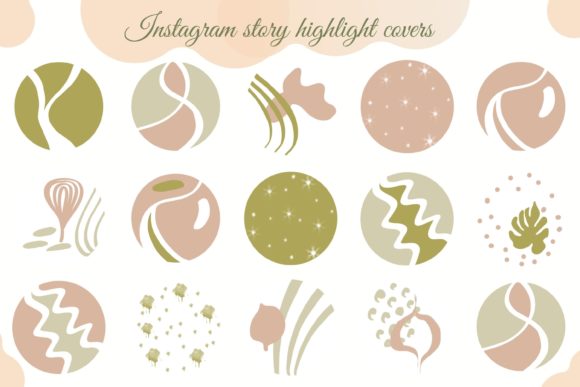
Earth Neutral Highlights, Trendy Media
See the listing ↗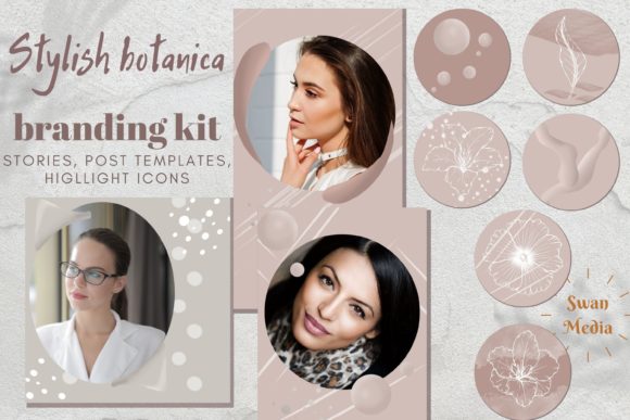
Pastel Beige Instagram Story Highlights
See the listing ↗From the collection Black & Neutral Highlight Covers. New Creative Fabrica members get 10 free downloads, and any of these can be one of them.
For a feed built around one strong color, take the covers from the same family. These are named for green, blue and brown.
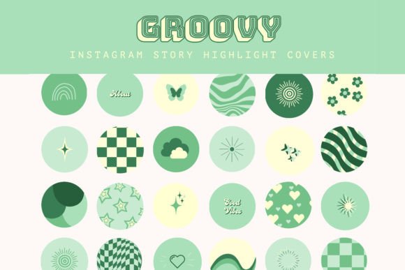
Green Retro Instagram Highlight Covers
See the listing ↗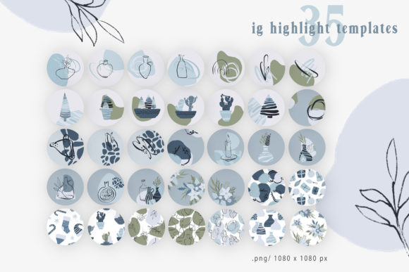
Blue Abstract Instagram Highlights
See the listing ↗
Pearl & Brown Instagram Story Highlights
See the listing ↗From the collection Colorful Highlight Covers. New Creative Fabrica members get 10 free downloads, and any of these can be one of them.
The same goes for the avatar beside the row; profile picture ideas explains how to tie it in. More cover sets by color are in the black and neutral and colorful collections.
Pick One Rule and Run It for Nine Posts
Choose the layout whose upkeep matches how you really post, not how you hope to. Then commit for nine posts, three full rows, before judging it. A pattern is invisible at three posts and obvious at nine.
If you break the rule twice in those nine, the layout is too strict for your routine. Step down a level in the table. A palette you keep looks better than a puzzle you abandon halfway.
Cover Sets Related to This Guide
Black & Neutral Highlight Covers11 hand-picked · open the collection → Colorful Highlight Covers11 hand-picked · open the collection →


