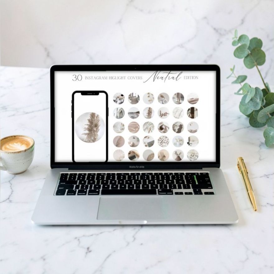
Make each highlight cover on a 1080 x 1920 pixel canvas, the same size as a story, or on a 1080 x 1080 square. Both work. Instagram's Help Center gives no official cover size at all; these two are the sizes designers have settled on. What matters more than the canvas is where the icon sits: small and exactly in the center, because Instagram shows only a circle cut from the middle of the image and throws the rest away.
The Two Canvas Sizes That Work
| Canvas | Pixels | Ratio | Good for |
|---|---|---|---|
| Story size | 1080 x 1920 | 9:16 | The standard for most cover templates; the same file can also be posted as a story |
| Square | 1080 x 1080 | 1:1 | Easier to judge the circle by eye; smaller files |
Instagram does not ask for one exact cover size. Its instructions say only to tap "Edit cover" and choose a cover photo; it takes whatever image you pick and lets you place a circle on it. So a cover from a template set and a cover you built yourself on a square behave the same way, as long as the icon is centered.
Do not go much smaller than 1080 pixels on the short side. The cover is displayed tiny, but you will zoom in when you place it, and a small file turns soft as soon as you do. There is no gain in going larger either: for photos, the Help Center says Instagram keeps a width of up to 1080 pixels and sizes anything bigger down to that.
The Numbers at a Glance
| What | Figure | Where it comes from |
|---|---|---|
| Story-size canvas | 1080 x 1920 px | The standard story size |
| Square canvas | 1080 x 1080 px | The standard square post size |
| Widest circle on a story-size canvas | 1080 px across | Geometry: the circle cannot be wider than the canvas |
| Hidden above and below that circle | 420 px each | (1920 - 1080) / 2 |
| Share of a square that a circle hides | About 21 percent, all in the corners | Geometry |
| Outer safe area most size guides quote | 720 x 720 px, centered | Third-party guides, not Instagram |
| Zone this guide recommends for the icon | A circle 500 to 600 px across | A rule of thumb with extra margin |
| Widest photo Instagram stores | 1080 px | Instagram Help Center |
Why a Tall Canvas for a Round Icon
The story-size convention is a leftover. Covers used to be chosen only from the stories inside the highlight, so designers made each cover as a story: a full 9:16 frame with the icon in the middle. You posted it, added it to the highlight and picked it as the cover.
Today you can pick a cover from your camera roll without posting anything, as described in how to add highlight covers. The tall canvas is no longer required, but most sets still use it, and it does no harm. The extra space above and below the icon is simply never seen.

How the Circle Crop Works
When you choose a cover image, Instagram lays a circle over it. You pinch to zoom and drag to move the picture underneath, and whatever is inside the circle when you confirm becomes the cover.
Two bits of geometry explain most cropping surprises:
- A circle loses the corners. A circle drawn inside a square covers only about 79 percent of it (pi divided by four). Anything placed toward the corners of your design is gone.
- A tall canvas loses the top and bottom. On a 1080 x 1920 canvas, a circle as wide as the canvas takes just the middle 1080 pixels of the height. The top 420 and bottom 420 pixels fall outside it.
This is why a decorative border that runs around the edge of a story-size cover never appears on the profile, and why text placed under the icon tends to vanish.
The Safe Zone: Keep the Icon in the Middle Half
A reliable rule: keep the whole icon inside a centered circle about half the width of the canvas, roughly 500 to 600 pixels across on a 1080-wide design. This is a design rule of thumb, not an Instagram requirement. Size guides usually draw the limit a little wider, as a centered square of about 720 x 720 pixels; treat that as the outer edge and the half-width circle as the comfortable target. There are three reasons for staying well inside.
- Breathing room. An icon that touches the rim of the circle looks squeezed. Space around it is what makes a row of covers look tidy.
- Room to zoom. If the icon is small on the canvas, you can zoom in a little when placing it. If it already fills the canvas, there is nowhere to go and the edges are cut.
- The ring. Instagram draws a thin ring around each highlight circle. Artwork that runs right to the edge of the circle collides with it visually.
To see the safe zone while you design, draw a circle about 540 pixels wide, center it on the canvas, and keep the icon inside it. Delete the guide circle before you export. The guide to making covers in Canva shows where the centering tools are.
Background color or texture should fill the entire canvas, edge to edge. Only the icon needs to stay inside the safe zone. A background that stops short leaves a visible edge when you zoom out.

Design for the Size People Actually See
On a profile, a highlight cover is about as big as a shirt button. Guides that measure it put the circle somewhere around 80 to 115 pixels across, depending on the phone, which is roughly a tenth of the width you designed at. Detail that looks lovely at full size turns to noise at that scale. Design for the button.
- One shape per cover. A camera, a heart, a shopping bag. Scenes with several objects blur together.
- Thick enough lines. Hairline strokes disappear. If a line is hard to see when you hold the phone at arm's length, thicken it.
- Strong contrast. A dark icon on a light background or the reverse. Pale gold on cream looks refined on a big screen and invisible on a profile.
- No words in the artwork. The highlight's name is printed under the circle already. Lettering inside the circle is too small to read, apart from a single initial or a short symbol.
Icon sets drawn in one consistent line weight make this easy, since each cover carries a single mark. These three are named as icon sets and show the idea well.
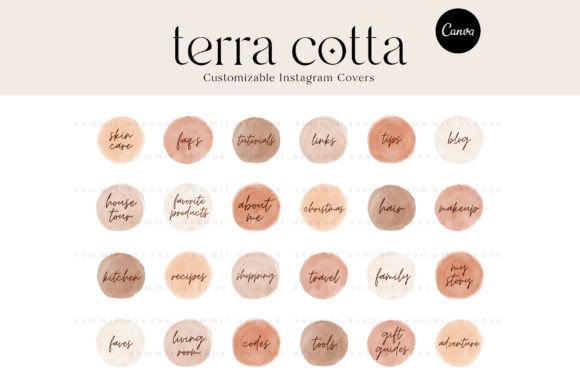
Editable Instagram Highlight Cover Icons
See the listing ↗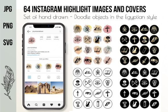
Hand Drawn Instagram Highlight Icons
See the listing ↗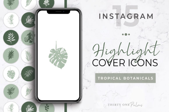
Botanical Instagram Highlight Icons
See the listing ↗From the collection Aesthetic Highlight Covers. New Creative Fabrica members get 10 free downloads, and any of these can be one of them.
PNG or JPG
Either format uploads fine. The choice depends on what is in the picture.
- PNG keeps flat colors and sharp edges clean. Use it for line icons, solid backgrounds and anything with crisp shapes. Canva's own file-type guide calls PNG the best choice for graphics.
- JPG handles photos and soft textures such as watercolor, marble or gradients, and gives smaller files.
The cover ends up as a tiny circle, so the difference on the profile is small. One thing to avoid is a transparent background. Instagram does not document what happens to transparency in a cover, and a see-through area can come out as a solid color you did not choose. Export every cover with its own background.
Using a Square Image or a Photo
A square file is the simplest case, because the circle fits inside it with nothing wasted above or below. If you are making covers from scratch and do not plan to post them as stories, a 1080 x 1080 canvas is a sensible choice.
Photos work as covers too. Pick one with a single clear subject in the middle and a calm background, then zoom until the subject fills about half the circle. A face, a product or one flower reads well. A landscape or a group shot does not, for the same reason detailed icons fail.
The same circle logic applies to your avatar, which sits close to the highlights; the guide to profile pictures that read at thumbnail size goes through it.
Common Sizing Mistakes
- Icon too big. It fills the canvas, so the circle cuts into it. Shrink it to the middle half.
- Icon off center. Even a small shift is obvious when six covers sit in a row. Use the alignment tools instead of placing by eye.
- Different scale on each cover. The envelope is huge and the star is tiny. Size every icon to the same guide circle.
- Background does not reach the edges. A white strip appears when you zoom out. Extend the background to the full canvas.
- Exporting small. A cover saved at a few hundred pixels blurs when zoomed. Export at full size.
Ready-made story highlight sets are normally built with all of this handled, which is the main reason to start from one rather than a blank canvas.
One more case is worth planning for. On some profiles Instagram has moved highlights from the row of circles into a tab of their own, and people who have that layout report the covers showing as taller thumbnails instead of circles. Instagram has not published a size for that view. A cover built the way this guide describes, with the icon in the center and the background running to every edge of the canvas, survives either crop.
Luxury Instagram Story Highlight Icons
See the listing ↗
Abstract Instagram Story Highlight Icons
See the listing ↗
Instagram Story Highlight Covers, Icons.
See the listing ↗From the collection Instagram Story Highlights. New Creative Fabrica members get 10 free downloads, and any of these can be one of them.
Check It on Your Own Profile
Upload one cover before you make or buy thirty. Set it on a highlight, then look at your profile from the normal viewing distance. Ask three questions: is the icon recognizable at a glance, is there clear space between it and the rim, and does it still read in dark mode?
If the answer to all three is yes, repeat the same canvas, the same guide circle and the same zoom for every other cover. If not, change the file and try again; it costs nothing to replace a cover. When you want more styles to test, the aesthetic highlight covers collection is a good place to compare line weights and backgrounds side by side.
Cover Sets Related to This Guide
 Aesthetic Highlight Covers13 hand-picked · open the collection →Instagram Story Highlights8 hand-picked · open the collection →